We can learn a lot from the color schemes in film and apply it to the theme we choose for an event. Color has a deep psychological impact on the way we see and interpret images. Certain color combinations help images pop and draw attention to detail. When branding content. The right color palette differentiates products and gives images an extra layer of visual branding.
Looking at different color schemes in film you can get an idea of what works to catch people’s attention.
Monochromatic
This scheme is based on a single color hue, like Wes Anderson’s use of shades of yellow in his film Moonrise Kingdom. This extreme color harmony creates a heightened sense of reality.
Complementary
When filmmakers are looking for an intense color contrast, they choose complementary colors. Located on opposite sides of the color wheel, this combines one warm color with one cool color to produce a vibrant, high-contrast effect. In La La Land, this technique is used to spotlight a certain character on screen.
Analogous
Found in nature, analogous colors neighbor each other on the color wheel. These colors work together to create an overall balance and harmonious feeling. Analogous cool colors have a slightly more jarring feeling, which can be seen in the movie Moonlight.
Triadic
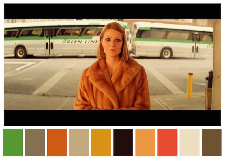
Red, blue, and yellow is an example of a triadic color scheme, which uses colors evenly spaced across the color wheel. It is the least commonly used color scheme, often used for 1970’s period pieces. GE recent commercial about Molly, the girl who never stops inventing, is a good example of this color scheme.
Two to three key colors will help you sustain your message in the audience’s mind. Make sure you choose your color scheme early in your project. If you have any questions about color schemes or planning an event, contact us.